Maryhill Vintners Update 2016
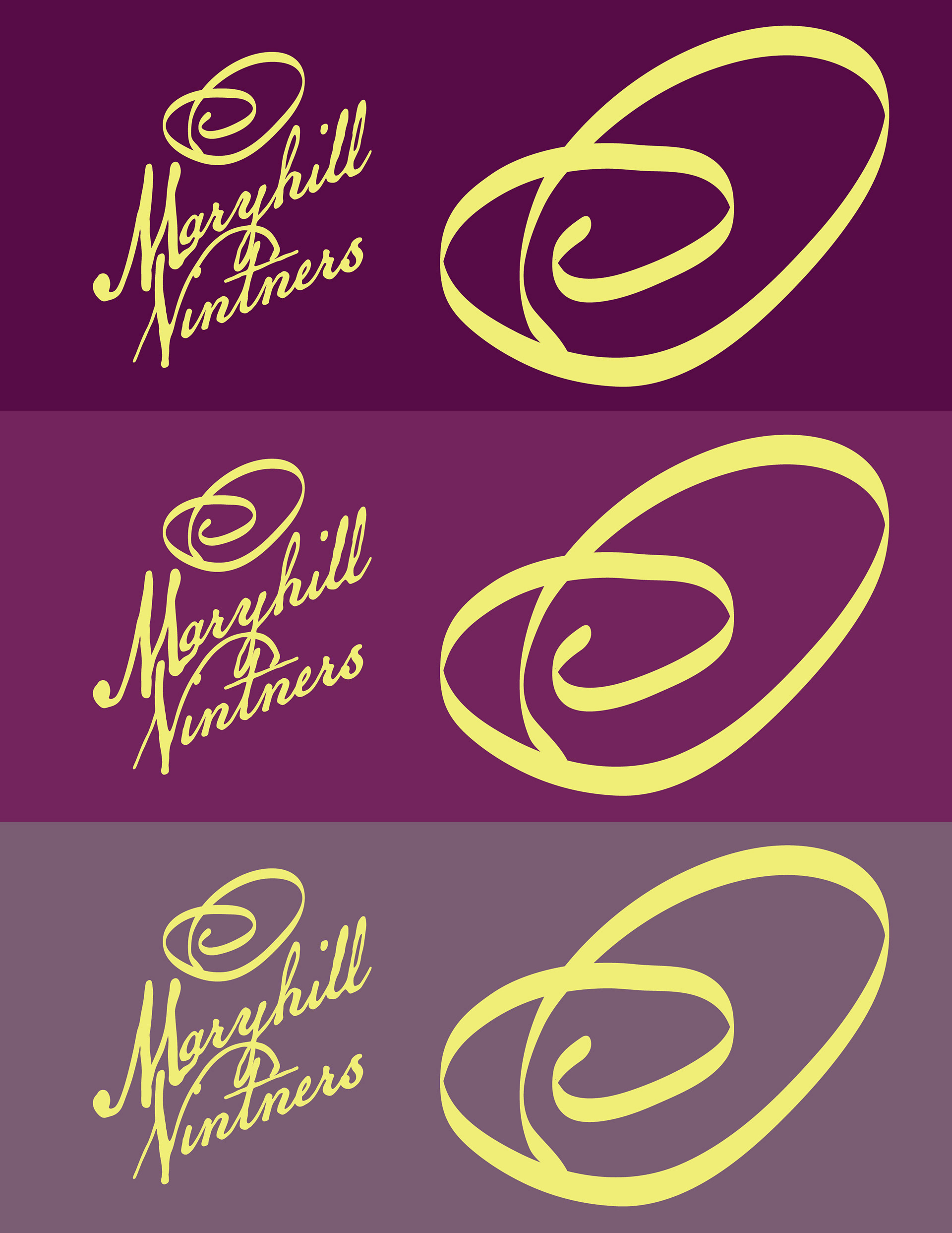
The 2016 design aesthetic was so different from 2001 design trends, so I wanted to try redesigning something I did in 2001 with a 2016 design awareness. This is something that would happen with products like wine every so often so that the label can keep standing out. I updated the fonts in the logo and the layout to match the 2016 trends. I updated the colors to match the 2016 bright palettes. The whole point of choosing yellow in the old design was that yellow was rarely used or seen on shelves in stores in 2001. Yellow also matched the theme of the hot sun of the central valley in Washington state. I also updated the background to be textures instead of the watermark only. It is always fun to go back and look at my own old designs and be able to appreciate them, see how long they have lasted in looking relevant and not trendy, and then to be able to update them into today's or tomorrow's design trends. Updated 2021.
