Thirty Logos - Day 13 - JJ Pizza
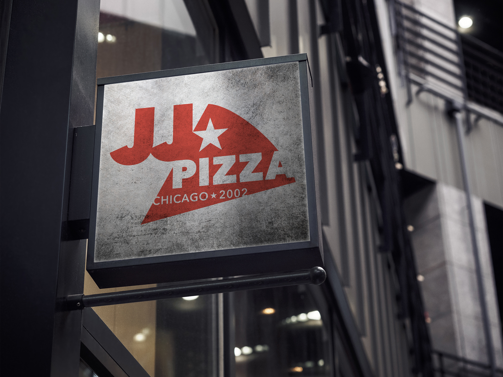
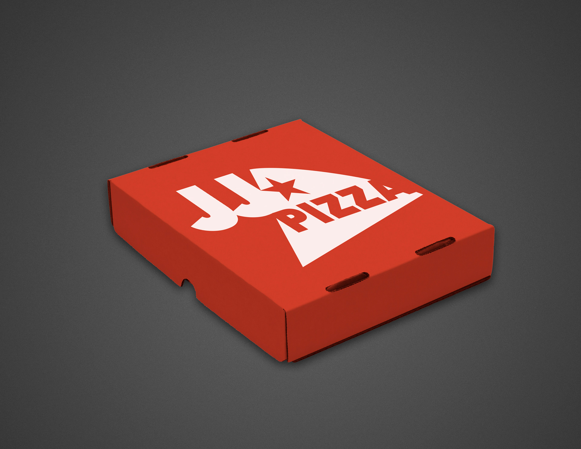
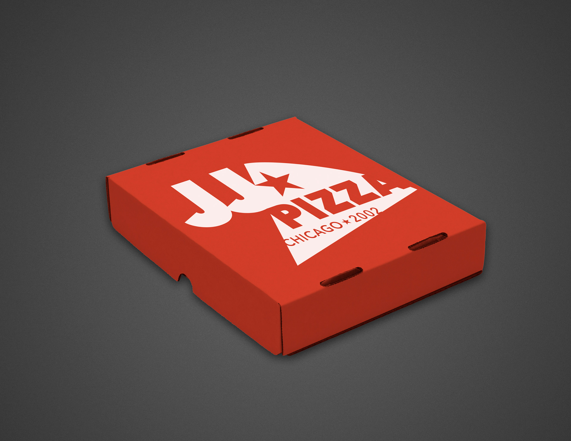
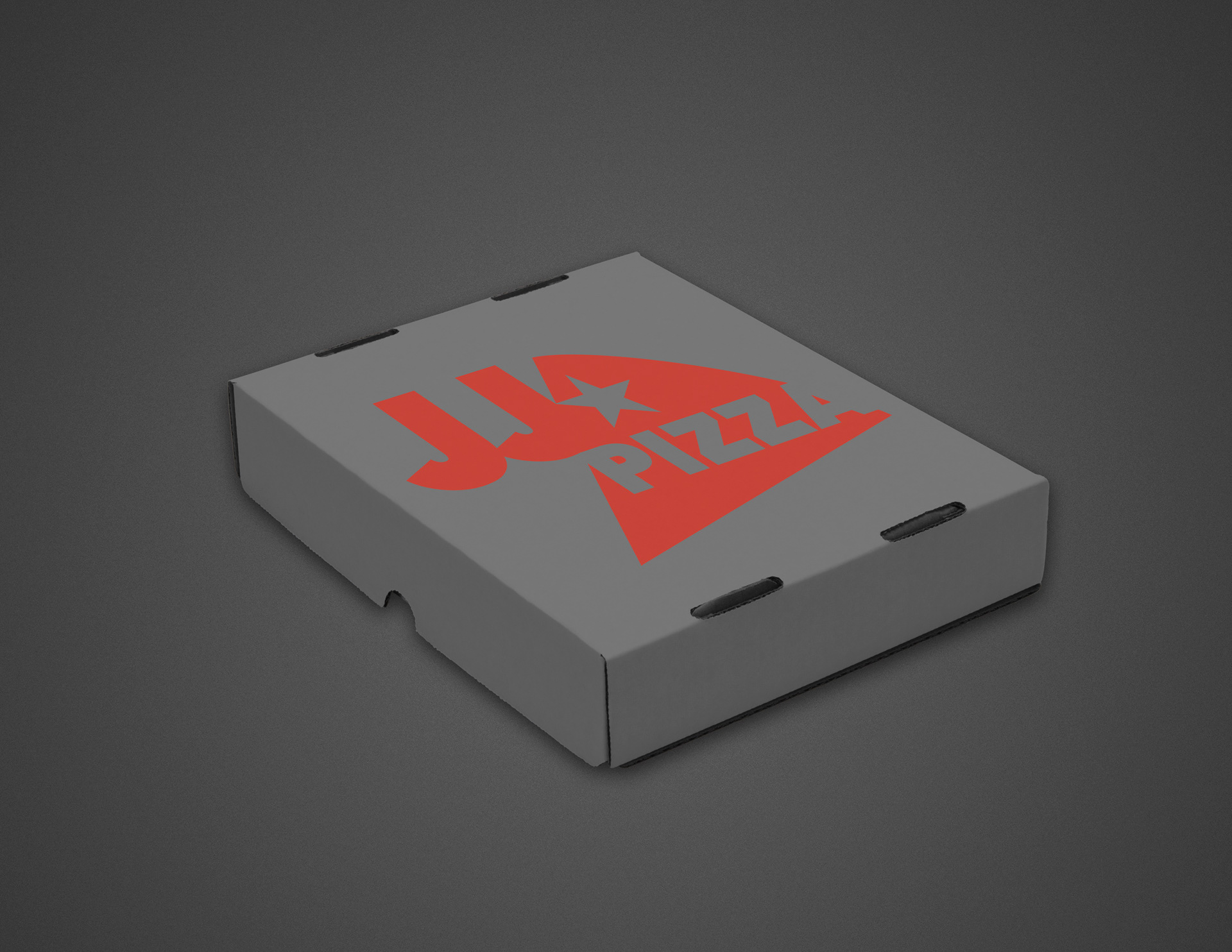
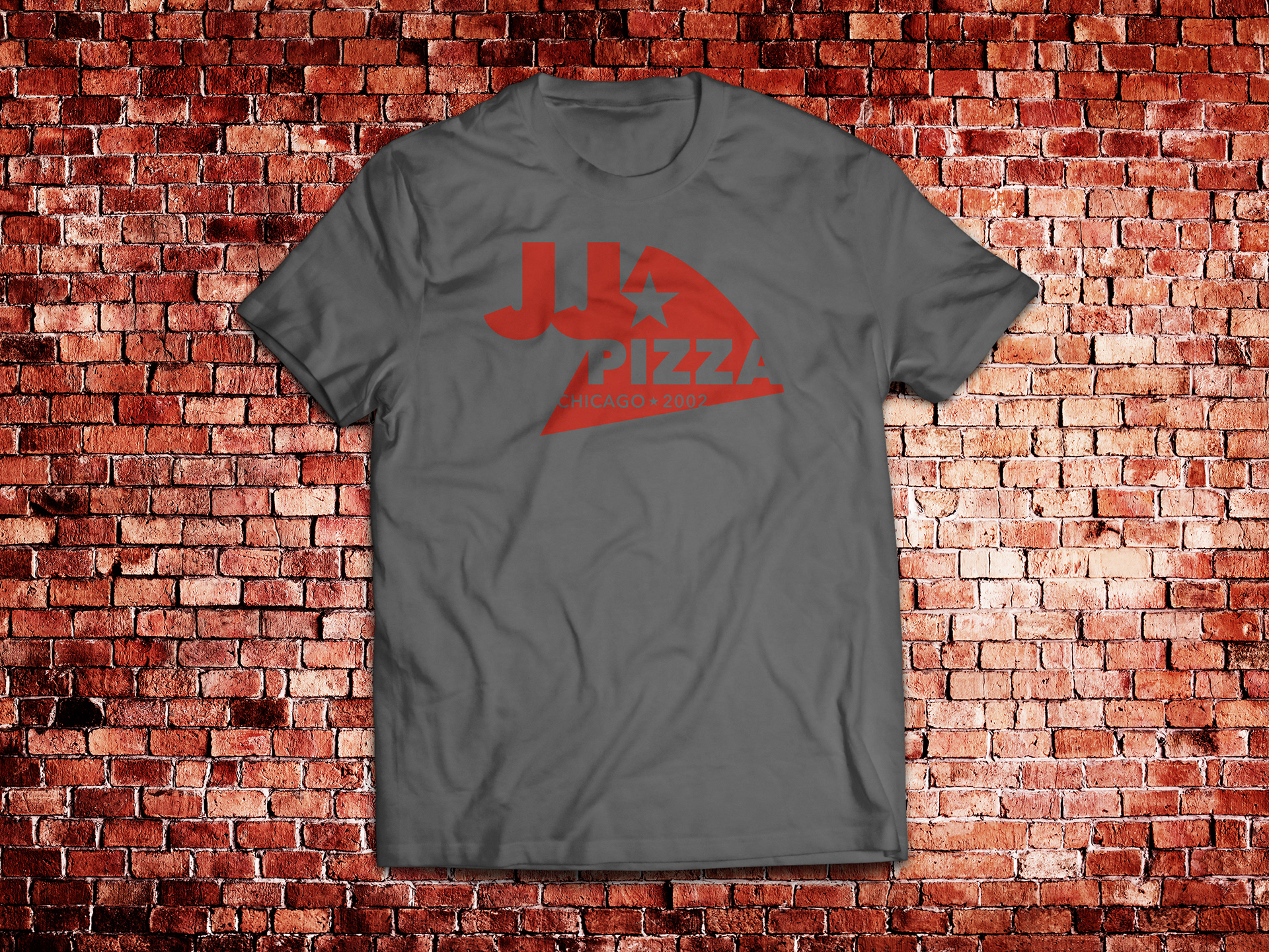
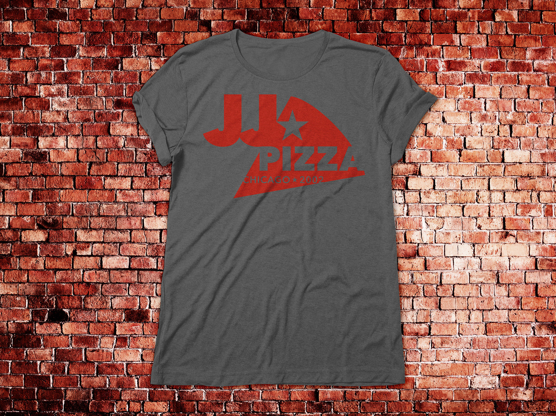
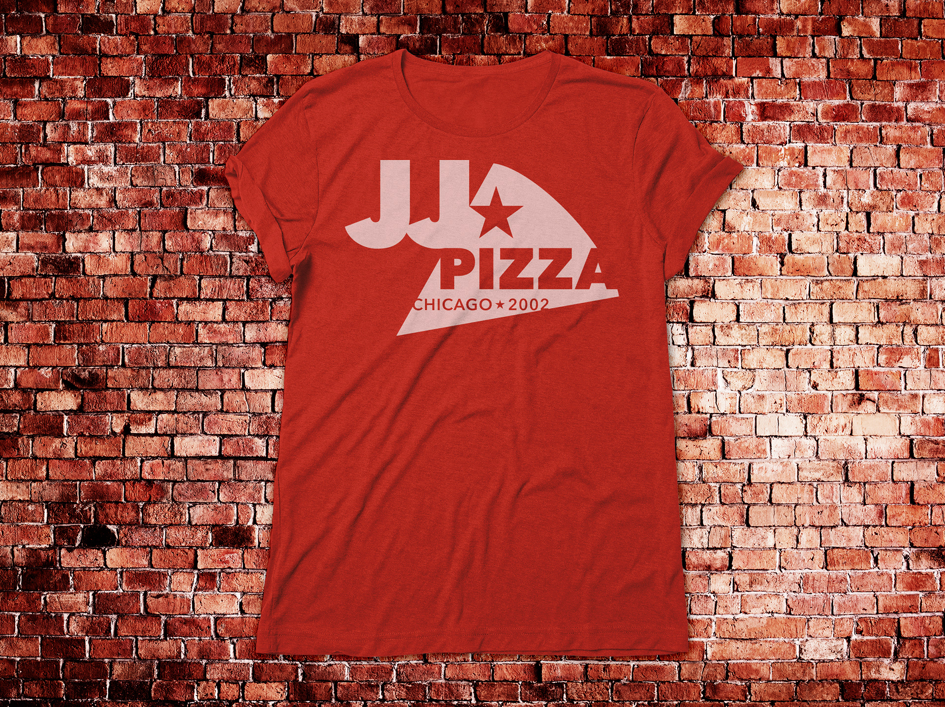
Thirty Logos Challenge - Day 13 - JJ Pizza - Made in Chicago Pizza since 2002. For this logo challenge I wanted the pizza to be the enclosure for the identity but for JJ to stand out. I really wanted this design to be very heavily graphic, more about shapes, that eludes to pizza, instead of literal "pizza", to blend in more with a contemporary city style. There are two versions of the logo to use depending on the size of printed item and in which direction the owner wants the logo to be shown . The 1st is just the logo. The 2nd is the logo with tagline "Chicago (star) 2002". Chicago is where the pizzeria is based. It was established in 2002. I used stars as a secondary visual cue because of Chicago's flag. I also added grey to their red and white color palette to give the brand more options in what color background it can print on. The rename would be 1871 Pizza referring to the Chicago's Great Fire in 1871. I jumped on the chance to be able to rename with numbers here. Updated 2021.
