Thirty Logos - Day 16 - Sharp
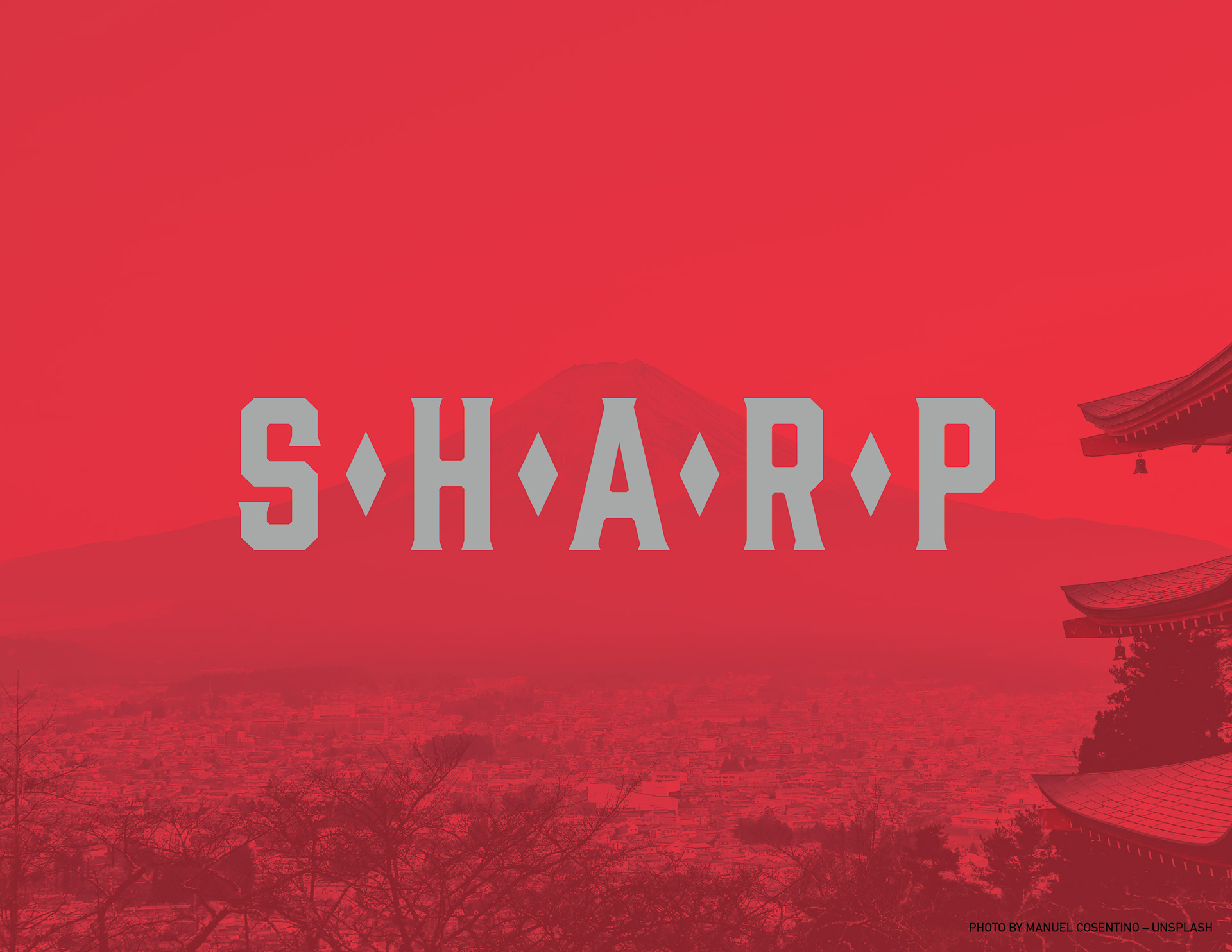
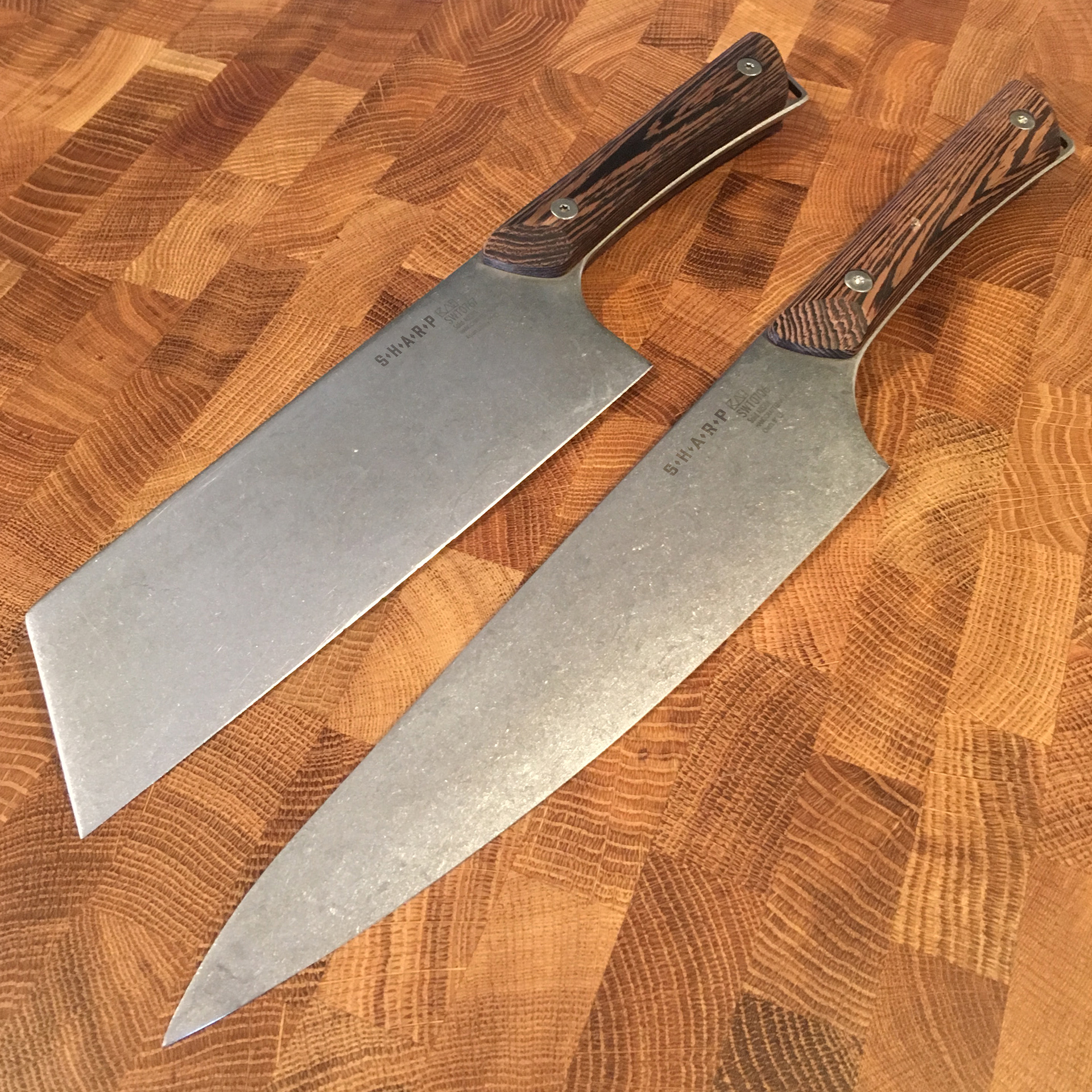
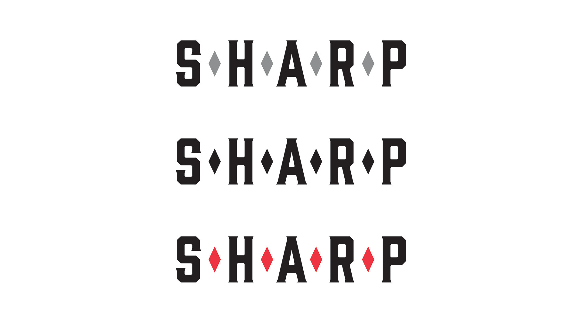
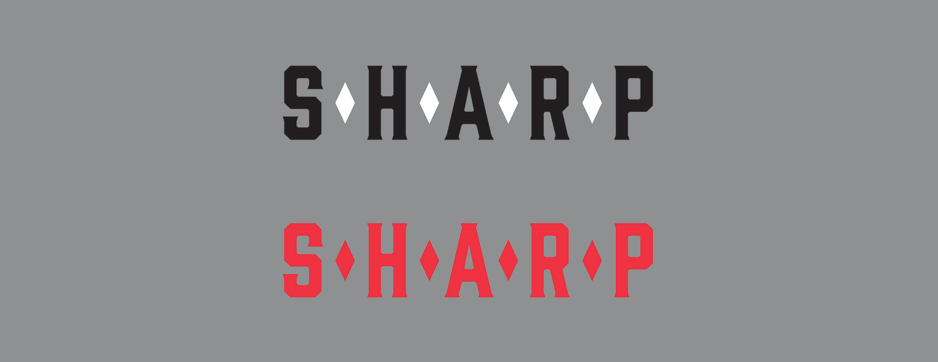
Thirty Logos Challenge - Day 16 - Sharp - a knife crafting company - For this identity challenge I really wanted to concentrate on the simplicity, utility, perfection, and heritage of a well made and timeless knife. I looked to Japanese design for this project because their expert and concise design tradition demonstrates all of these qualities. For the example photo of knives, I picked out the kind of knives I would want this company to make and they would have a distinctly Japanese look to them. The rename would be KoroCo. Koro has a meaning of "time" in Japanese and keeping with my timeless theme, this was a good name for this company.
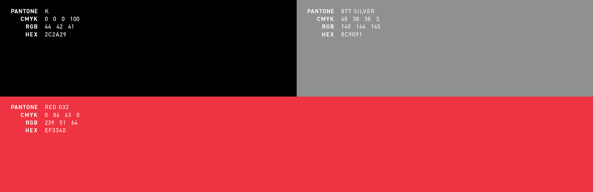
Graphic Design, Identity, Branding, Creative Direction - Illustrator, Photoshop, Adobe Type, Adobe Stock, iPhone, Unsplash, Japanese Dictionary